Creating a registration process for carpooling with inclusivity in mind

Introduction
A case in collaboration with two students, where the task was to design a sign-up flow on a mobile app for a government initiative to reduce carbon dioxide emissions.
I also worked a bit alone further on the design after our user test and did a competitive analysis to get insights in making an onboarding process for the user to know what to expect of the app.
The purpose of the app is to organise carpooling or sharing in countries where public transport is not reliable.
The user group is people who don’t own cars (aged 70 to 85) and sometimes need a lift, focusing on issues with their vision.
Executive summary
By making a short interview with two possible users of an carpool app we got insights of the mindset and difficulities with have slight visual impairments, even though they were using glasses.
A usability test of the design we made and to make a straw test myself got insights and possible improvements on the iterated process. An exciting design issue, which I kept going after the process with my two fellow students was over.
This executive summary is a brief of our design thinking journey in creating a carpool for the user group between 70-85 years with vision issues.
Check out the detailed results to see the ideas me and my team crafted and recommendations of improvements we found. Enjoy reading!
What
did we do in our journey?
- Research, like literature interview and interview
- Crafted user flow diagram
- Sketches and wireframes of the process to register for the use of carpooling
- Usability testing
- Iterations and further design
- Competitive analysis
- Focus on inclusivity and accessibility
Why
did we do it
- to address requirements of users aged 70 to 85, particularly those with vision issues – due to guidelines and recommendations for creating a carpooling app
Findings
from the process
- the user group have visual difficulties to have in mind when designing. Such as large text, high contrast, necessary information and clear descriptions.
- The design can’t only rely on color contrast as confirmation, but also need incorporation of visual elements e.g. bold strokes.
- Use of plain background to remove distractions, one font and a size at minimum 16px, clear feedback on confirmation or error, and “Remember me” as a smart assistant to promote cognitive function.
Part 1: The Challenge
Problem:
- Older people may struggle with vision, mobility and hearing. A mobile app targeting users aged 70 to 85, specifically those with potential vision issues, have a need of accessibility and ease of use. And it can potentially lead to confusion or frustration during a registration process.
Solution:
- Create a sign-up flow with a focus on accessibility and simplicity to address the unique requirements of users aged 70 to 85, particularly those with vision issues – due to guidelines and recommendations. Conduct user testing with the target user to identify any usability challenges and refine the design accordingly for an optimal user experience.
Scope:
- To design the sign-up flow for a mobile app intended for a specific user group, individuals aged 70 to 85 who do not own cars and occasionally require transportation assistance.
- The primary goal of the app is to facilitate carpooling or ride-sharing, particularly in countries where public transport is not dependable within the context of the government initiative to reduce carbon dioxide emissions.
- To particular focus on addressing issues related to the user group that may struggle with vision, mobility and hearing.
Team UXceptionals
Collaborative Excellence: Remote UX Collaboration with Dedication and Diversity
Throughout the year, my collaborative journey with two fellow students was a partnership I wouldn’t trade for anything. Also in this case about Accessibility. We recognized that our diverse strengths complemented each other, creating a dynamic where we all thrived. The synergy within our group was remarkable, driven by equal dedication and a shared commitment to understanding and applying what we learned.
Me an another could work together and have different opinions about some details around a wireframe, then we could wait for “the judge” – the third person in the group, and sometimes she had the last word. Or we discussed and got agree. We all assumed the role of the ‘third person’ as we juggled our collaborative efforts alongside our individual work schedules on different days. Sometimes we even discussed a design challenge, and found that we actually was totally agree.
Acknowledging the power of multiple perspectives in ideation sessions, we prioritized being together as a trio on these days. Despite being geographically dispersed – with me in Bergen and the others in Oslo – our remote collaboration was seamless. We leveraged digital tools like Teams for chat discussions and quick clarification phone calls. And worked remote on Figma, Miro and Figjam and used Docs to have control of the weeks process and tasks to be done. The distance never hindered our communication or productivity.
With two on the team excelled in graphic design and focused on details and interface intricacies, I delved into my curiosity, and was most busy with research and took charge of recruiting candidates for interviews. I developed a passion for crafting components for prototyping, and affinity mapping became a favorite method for uncovering insights.
The collaborative spirit we fostered, despite never meeting physically, remains a testament to the strength of our remote UX collaboration.
My role:
- Research; Literature interview and a interview with two in the target group to get insight in daily challenges individuals over 70 years and struggling with vision
- User flow diagram
- Sketches/Wireframes
- Components, states, prototyping
- Iterations
- Competitive analysis
- Sketches and low fid wireframes of onboarding screens and an extra page where the user could choose a recommended driver
Tools:
- Figma/FigJam
- Google spread sheet
- Canva
Part two: The process
Research
After a literature research there was found that elderly need large text, elements with high color contrasts, a simple design, only necessary information, and clear descriptions. They also need the design to correspond with assistive technologies such as screen readers, voice control, magnifiers, etc. This includes a tidy and systematic design, clear language, alt text for images and icons to mention a few.
From our own research, we wanted to gain insights on how to make an app user-friendly for the user group. I asked questions to two users over 70 years with poor eyesight and with different experience and trust in using a smart device. We gained valuable understanding of their behaviour, their likes and dislikes, and the challenges arising from diminished eyesight and opinions about apps.
The insight revealed difficulty maintaining focus without glasses when reading on mobile, a preference for concise text, and a desire for clear guidelines to avoid mistakes.
| Insights |
|---|
| Elderly may be skeptical of mobile apps due to ignorance and previous bad experiences |
| Need information that is easy to remember and understand |
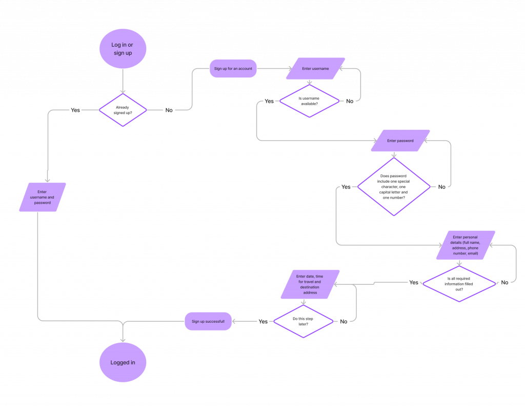
User flow diagram
- a visual representation of the steps a user takes to complete a specific task or achieve a particular goal in the application. It provides a overview of the user’s interactions and experiences, mapping out the sequence of actions from the starting point to the final outcome.
Wireframing
There were made sketches and then crafted low fidelity wireframes in Figma of the screens to make a prototype for the remote usability test later. Having accessibility in mind the design was easy to understand with buttons that had large tap areas, and clear, simple language.


Take a look at my document in Figma to see wireframes and the prototype used in the usability test.
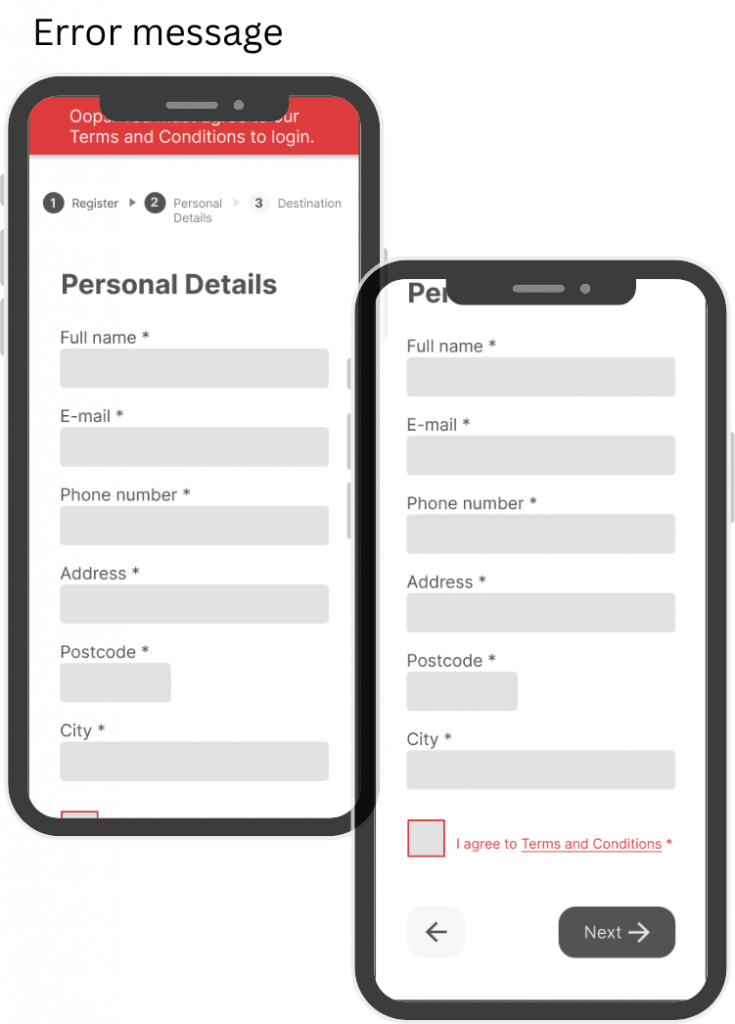
States, sucess and error messages
There were made components with different states and using colour together with well known visuals to help the target audience to get a clear message of the registration process.


Testing wireframes
Then the wirefames where tested on a relevant user. The participant was 59 years, a little younger than the target group, but had sight limitations and was using glasses with progressive lenses. He has hard time adapting to new technology and usually struggles to see the mobile screen clearly with his glasses on. The testing was done remote, trough video chat, with screen recording.
Test findings
| The participant was confused about what to do on certain steps, like what to type as a username, and why he had the option to add more than one destination. |
| The participant was using glasses with progressive lenses. When looking through parts of the lense, he was not able to see the smallest text. |
| When simulating vision impairment with a straw, we noticed that some of the elements were difficult to see. |

Part 3: Solutions&Iterations
Include sub headings to explain on every site what is happening
- Log in: Log in with your username and password to get a ride
- Register: Create a username and a password for future logins
- Personal Details: Please fill in your personal information for account setup
- Destination: Specify your destination for where and when you like to go
Heavier weight font to make text more clearer and readable
- Overall: Extra light to light
- Destination: Light to Regular
Small design changes for visual and accessible improvements:
- Overall: More white space between elements
- Overall: Higher content hierarchy to avoid excessive scrolling
- Login: “Forgot password” over field
- Destination: Bigger font size on “(Optional)”
- Welcome: Added logo to give the brands feel


Lessons learned so far…
From the research (both literature and our own), the insights were that this group have visual difficulties we need to have in mind when designing. Such as large text, high contrast, necessary information and clear descriptions.
Also from the beginning of this process, with sketching user flow and wireframes, we learned how iterations are essential and necessary for every design.
The meaning and usage of the design guidelines got clearer, and also some of the users way of thinking and attitude. Scepticism and concerns regarding use of digital products, and knowing that this group preferably like bigger screens and to not be “tested”. The participants who were interviewed wanted to be asked the questions on messenger instead of a phonecall or videocall.
Initially, a user flow in FigJam was created into a simple version. And then sketched various wireframes in Figma to see how to design the steps for the part where the user would register as a passenger. It was needed to revisit the user flow and add on possible errors messages and field states that could arise.
Figuring out the Destination-page was challenging. The solution was to make it optional, so it wouldn’t act as a hinder during registration if the user didn’t have a specific travel goal at the moment.
As a group, we brought forth new ideas and suggestions, drawing on the knowledge we gained through the curriculum on design principles, accessibility, and our own research methods such as the interviews and internet researches.
After testing, these guidelines and recommendations became even clearer. The design can’t only rely on color contrast as confirmation, but also need incorporation of visual elements e.g. bold strokes. Use of plain background to remove distractions, one font and a size at minimum 16px, clear feedback on confirmation or error, and “Remember me” as a smart assistant to promote cognitive function.
This is to say that designing for accessibility is not only for users that have sight limitations – or any other limitations – but is shown to be an advantage for all users of a digital product.
Part 4: Further design iteration
I wanted to look at more aspects of this design and worked a bit further on my own. I wanted to create an onboarding process with screens to inform the user what the app is about and what to discover. And did a competitive analysis to gain insights from similar apps. Following that, I created a new user flow, sketched and crafted some wireframe proposals with accesibility in mind.
Competitive analysis
- to evaluate strengths and weaknesses to a competitor, to identify areas where it possible to copy or find areas where it can be done some improvements.


Uber, Bolt and Lyft are all ride-sharing platforms that connect users with drivers through a mobile app offering transportation service.
Searching for inspiration on how to craft onboarding- screens, they had all three much of the same concepts when looking at the descriptions of the app on appstore. With clear headers on the top and visual content for the user to see what to expect.
Iterated User flow
After the competitive analysis and the insight I got from it, I created a more advanced User flow diagram to get all the details of how the flow could go for the user.
The competitve analysis gave me also insights in possibilities to give the user a few options of the drivers to select. So I made a few sketches and a wireframe of how that screen could look like, and further a new more advanced user flow where created.

Sketching and wireframes
Having accessibilty and the user group in mind I started sketching out some onboarding screens and created possible wireframes that could help the users to know what to get.


Upon successful account creation, presenting a suggestion page with nearby drivers can significantly enhance the user experience. This feature adds an extra layer of safety by providing access to driver ratings, photos, and names. Having information about the type of car a driver uses contributes to both safety and self-esteem considerations.
Furthermore, incorporating details about the user’s preferences, such as comfort level or a preference for eco-friendly options like electric cars, aligns the service with individual requirements and values. This not only enhances the user’s overall satisfaction but also supports the app’s commitment to providing a personalized and environmentally conscious transportation experience.
Take a look at my document in Figma to see my wireframes and components with different states.
Asssitive technology
To form a more inclusive app incorporation of assistive features would be crucial. Alternatively there could be provided alternative text for screen readers to announce the position and total number of slides in the onboarding process. Voice commands could also be integrated and supported, and the design should be easy to navigate using the keyboard instead of a mouse for those with motor impairments. Providing options for magnification and text scaling is also advantageous for users with visual impairments.
The carpooling app has a commitment to be inclusive and accessible to meet a range of users that probably have some issues and frustrations points when it comes to use of an app. Not only easy to understand, but easy to navigate and to be intuitive. And also for those using assistive technology.
Final thoughts
Having gained more insight into the importance of creating apps that prioritize accessibility and inclusivity, I realize that my design is not yet halfway complete. I aim to delve deeper into understanding user needs, considering testing the onboarding process with relevant users to gather their opinions and feedback. Testing small tasks is crucial for ongoing design to avoid investing significant time in a design only to find out it doesn’t work later on. It’s more effective to test frequently and be mindful of testing with the specific user group. I am also contemplating including users who utilize assistive technology to gain a better understanding of how it functions and how it can be tailored to meet their needs.
I can already see some new iterations on my onboarding screens like use of more space between some elements. Looking forward to keep this process ongoing.
I will keep you guys updated. Thanks for reading, and contact me if you have any advice or comments on my design.
References
Noroff, School of technology and digital media (no date). UXD Programme. Moodle. Accessibility – Module 4. Available at: https://noroff.bravais.com/s/D3uRIfrVH9J33Eyvco63 (Accessed: 10 November 2023).
Girardot, A. (2023) UX design for seniors, Digital Scientists. Available at: https://digitalscientists.com/blog/ux-design-for-seniors-5-tips-2/ (Accessed: 10 November 2023).
Digital, S. (2019) Accessible Design: Designing for the Elderly, Figma. Available at: https://www.figma.com/exit?url=https%3A%2F%2Fuxplanet.org%2Faccessible-design-designing-for-the-elderly-41704a375b5d (Accessed: 10 November 2023).
Why do many seniors have trouble using technology? (no date) No Isolation. Available at: https://www.noisolation.com/research/why-do-many-seniors-have-trouble-using-technology (Accessed: 10 November 2023).
Brækhus, Leni. (2015) Utvikler app som skal sørge for at eldre spiser bedre. Available at: https://www.abcnyheter.no/livet/2015/03/06/219408/utvikler-app-som-skal-sorge-for-at-eldre-spiser-bedre?redirect=true (Accessed: 10 November 2023).
What do the apps for visually impaired need to have? (2021) Por RankMyApp. Available at: https://rankmyapp.com/what-do-the-apps-for-visually-impaired-need-to-have/ (Accessed: 10 November 2023).
Gupta, D. (2023) How to Design Accessibility App for Visually Impaired? Available at: https://appinventiv.com/blog/design-accessibility-app-for-visually-impaired/ (Accessed: 10 November 2023).
Link to Google Sheets: https://docs.google.com/spreadsheets/d/1DhN9nQSEOKnih5uDG3zcZI3rt6cc8Up7E2k7lQD06qI/edit?usp=sharing
Link to Figma: https://www.figma.com/file/Ipvp1GMXlKkm7lSnrBGJqa/Untitled?type=design&node-id=0-1&mode=design
Link to Prototype1: https://www.figma.com/proto/Ipvp1GMXlKkm7lSnrBGJqa/Untitled?page-id=0%3A1&type=design&node-id=81-514&viewport=439%2C401%2C0.11&t=jUSWw7DS6EakiR4a-1&scaling=min-zoom&starting-point-node-id=81%3A514&mode=design
Link to Prototype 2: https://www.figma.com/proto/Ipvp1GMXlKkm7lSnrBGJqa/Untitled?type=design&node-id=81-514&t=XI1pMvsAKavoTPVK-1&scaling=min-zoom&page-id=0%3A1&starting-point-node-id=81%3A514&mode=design